Color is central to interior design, and a powerful element in our daily lives. The colors of our homes, our clothes, our gardens, our workspaces, the food we eat — all are surprisingly intertwined with how we feel. When I taught courses on color symbolism in cinema, it was fascinating to see how room colors affected the emotional mood of a scene. Color’s impact on our moods can be palpable, and some colors may cause a tinge of sadness or an unexplained anxious vibe. Fortunately, there are easy ways to identify “sad” colors, and solutions to make them work.
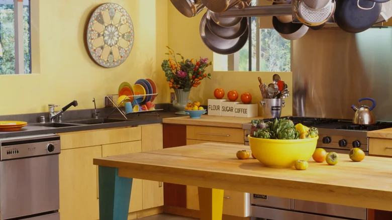
Most people are personally affected by certain colors. If we truly enjoy a color, then any potentially negative psychological impact is less likely to affect us, because we’re predisposed to like seeing it. Likewise, even with a cheerful color like pink or orange, if we dislike these colors, their presence may affect our mood. I can’t deny a pale yellow kitchen is cheery looking, but I personally don’t like yellow, so for me, it’s a no-go.
A room’s purpose and function also affect how colors feel. Pale blue walls in a bedroom may feel calm and serene, but in a kitchen might feel cold and slightly sad. Black walls in a den or TV room might seem sleek and sophisticated, but in a dining room seem overpowering and inhospitable. Hues, tones, and intensities of colors also affect their impact. Consider a bright, fire engine red kitchen with cool white trim; this sounds intense and uncomfortable, but a muted, cranberry red kitchen with cream trim has a vibe that’s warm, cheery, and cozy.
Medium gray is the ultimate neutral
Gray is a classic color in interior design since it’s the ultimate neutral. There are warm grays, cool grays, and grays with various undertones, including yellow, green, blue, brown, and purple. Gray can be a wonderful backdrop, adding a balancing effect of coolness or warmth. Think of a mushroom gray velvet sofa in a maroon living room, or a gray silk bedspread in a light coral bedroom.
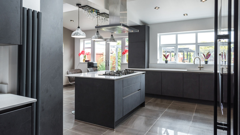
Gray as a color trend has also been making its way into unexpected rooms, including the kitchen, which is usually thought of as a place of gathering, happiness, and hospitality. In recent years, neutral color palettes have ruled kitchen design. Think white cabinets and tile, stainless steel appliances, and neutral countertops. Too much neutral color, though, such as gray kitchen cabinets, may be a mistake since gray surroundings can be associated with feelings of depression or dullness. If you do want gray walls or cabinets, try a warmer shade such as Benjamin Moore’s brown-and-purple-tinted Elephant Gray or mauve-inflected Angelica. Avoid grays with blue undertones since they may feel austere and cold.
You can lighten up the vibe in a gray kitchen with brightly colored accents. Think colorful crockery, green plants, rainbow-hued linens, or bright appliances such as a hibiscus pink KitchenAid mixer. Kitchen tile backsplashes are also still popular, with the best colors making your kitchen an attractive, enjoyable place to be. Why not a lively turquoise, vivid green, or rich terracotta? Or even a patchwork design with all three? You can also get warm metallic backsplashes in copper and rose gold, both of which warm up gray tones.
Chartreuse green is risky but impactful
Green, from alluring emerald to calming forest to soothing seafoam, has become a popular décor color. In color symbolism, green is complex, with a range of associations based on specific hues that color experts agree people respond to highly personally. Green may invoke nature, harmony, and energy. It may also invoke illness, decay, jealousy, or discomfort, especially overly bright greens or greens that contain a lot of yellow. Think of the moods a pale mint green, dark olive green, or vivid Kelly green conjure up for you.
Chartreuse (the name of a traditional French herbal liqueur) is a somewhat bright, acidic color that many people find off-putting in large amounts. It’s an example of how colors can affect how we see skin tone: In large amounts, chartreuse can make people appear sickly. However, there is vibrancy to chartreuse that lets it work well as an accent color in very small amounts, especially with deep blues, purples, and browns. As a wall color, however, it’s a risky choice. It’s too stimulating for a bedroom, too brash for a living room, and potentially unappetizing in a kitchen. The best use of this shade for walls is to tone it down a bit with white, and maybe a touch of warm gray, for a muted spring green. Try Benjamin Moore’s Spring Meadow Green for a cheery, light shade that’s not too yellow, Sounds of Nature for a paler, calmer look with a hint of blue, or Easter Hunt for a gentle, somewhat neutral pastel.
Beige is tasteful but can be bland
Is beige the actual problem? Or is it how people often style this color? Beige can be a versatile home interior color since it’s both neutral and calming. Undertones often define beige: Yellow-toned versions feel warm and comforting while gray-toned beiges, such as Sherwin-Williams’ Drift of Mist or Fawn Brindle, feel cool and classy. Meanwhile, a light beige, such as Sherwin-Williams’ Crème, is a nice alternative to white.
However, pairing beige walls with beige furnishings, such as rugs, curtains, furniture, and linens, feels bland and commonplace. Adding bold color with an accent wall, large furniture piece, or fabric accents such as cushions makes a beige room feel more lively. For a rich, earthy look, pair warm or cool beige with deep reds such as maroon or burgundy, rust orange, or medium terracotta. Emerald green or teal lend vibrancy to a gray beige, while a medium, neutral green adds a calm, nature vibe to a warm beige. Deep marine blue is a solid jewel tone that balances beige’s middle tones. Finally, you can’t go wrong pairing almost any shade of beige with a medium-toned, neutral rose pink for energy and warmth.
Black is strong and requires balance
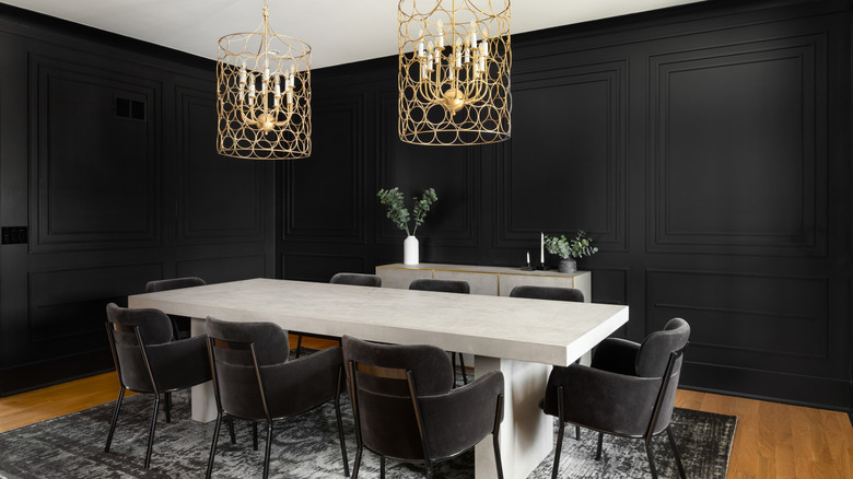
Black is getting to be a popular color choice for painting walls. Many folks consider it the ultimate in sophistication or chic, particularly in rooms used for entertaining. Personally, I find it a difficult color to use because it tends to suck the light out of a room. Choosing a paint finish that reflects a bit of light, such as satin or semi-gloss, can help, as can lightening the color to a deep charcoal gray. But, overall, black walls can create a vibe that is somber and oppressive. There are ways to ameliorate this, though; you may have guessed the key is color.
Making black work in a room requires adding colors or furnishings that give an impression of light, brightness, or softness. It’s not as simple as just adding white. Indeed, a black-and-white room, while striking and stylish, may feel overstimulating or busy. To make black and white work, add another focal point of color, such as warm wood furniture, brass light fixtures, or green plants. These add neutral hues but also help reflect light. Adding rich jewel tone colors that aren’t too saturated can also soften black’s edginess. Think garnet red, amethyst purple, or sapphire blue. But, because of black’s intensity, there is a tendency for a dual-color theme to look artificial, like a game board. Adding a triad or quartet of color is a better approach, creating a more balanced palette that lets the black backdrop support, rather than overpower, the room. Try analogous colors in muted shades such as blues, greens, and purples (or purples, reds, and oranges) to create a richly varied atmosphere.
Deep purple can be dramatic or calming
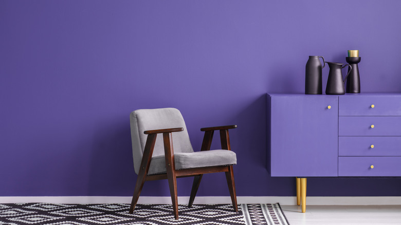
Deep purple can be a very dramatic color; wall paints in this hue should be chosen carefully. If a purple is too dull, it can cause an oppressive or sad feeling, but if it’s too bright or saturated, it can feel too stimulating. Sometimes, purple can feel whimsical or youthful; lighter purples are even an increasingly common bedroom color choice for teenagers. For a living room, you want a purple that isn’t too distracting, but also not too light or too subdued.
Some medium-toned purples have a lot of gray or brown tones that make them look muddy and dull, which can give rooms a sad feeling. Blue-toned dark purples are associated in some cultures with royalty, but with the occult or death in others. In a room, a blue- or indigo-toned purple can feel darker and more intense than a red-toned purple while red-toned purples have more warmth, lessening the “cold” vibe dark purple sometimes has. For example, a deep, rich plum with red undertones can make a room feel inviting, sophisticated, and calming. Benjamin Moore has a good selection, including Summer Plum, Passion Plum and Carter Plum. You can also try to lift the potentially “down” feeling of dark purple with a bit of bright, contrasting color in your décor, such as spring green, pale turquoise, or sunny yellow. Neutral blue-green hues such as dusty teal or forest green can also soften a deep purple and add a hint of nature.
Dark blue is all about the undertones
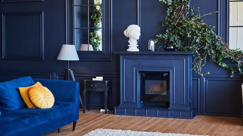
Dark blue is a tricky interior color because of its relative intensity and subtle undertones. It’s ubiquitous in the art and design world, but is sometimes associated with negative emotions such as sadness and melancholy. Like black, dark blue also has a way of absorbing light, so consider a light-reflecting paint finish, metallics, or light-reflecting fabrics such as silk, velvet, or brocade as accents.
Dark blue pairs well with many contrasting color schemes. Warm gold shades are a good way to balance its depth and intensity. Blue paired with dark or medium reds can feel a bit too cold or stimulating, but other red-related colors, such as muted plum or various berry shades, can warm things up. A dark, neutral navy blue, such as Benjamin Moore’s regal Hidden Sapphire or classic New York State of Mind, can also work nicely with light muted pinks (such as Benjamin Moore’s Coral Dust or Peach Kiss) or a neutral orange (such as Farrow & Ball’s Naperon or Faded Terracotta).
If you’re determined to have a dark blue room, consider the undertones while choosing your color. Dark blues with purple or indigo tones tend to look darker than green-toned blues such as teal. Super bright blue is very stimulating, so avoid this color in a bedroom or other space meant for relaxation. Some dark blues I’d suggest for a living room space that have an uplifting vibrancy to them include Farrow & Ball’s rich, neutral, not-too-intense Dinnerware, Benjamin Moore’s gorgeous, deep teal River Blue, or Little Greene’s navy Deep Space Blue with a perfect touch of green.